Australia's top destination
for live
and on-demand sports.
Overview.
Kayo Sports, an online sports streaming service, launched with the goal to stake a significant claim in Australia's competitive sports streaming market. The key challenge lay in developing a seamless user experience for their innovative offering dubbed "the Netflix of Sports," to entice and retain subscribers in a saturated market. The task at hand for our team involved crafting a tailored sports streaming platform for the 3.5 million fervent Australian sports aficionados, enabling them to enjoy their preferred teams and sporting events across various devices. The ambitious project required the rapid implementation of product functionalities and feature enrichment within a stringent 12-week timeframe, all while ensuring alignment with the overarching business objectives.
Key Responsibilities.
As the User Experience Lead, I played a pivotal role in designing and crafting the core experience for our platform. My responsibilities included not only conceptualizing and developing key user interfaces but also ensuring that every aspect of the user journey was seamless and engaging. To achieve this, I collaborated extensively with the Head of Experience and Product, fostering a dynamic partnership that was integral to our success. Together, we implemented a continuous feedback loop where ongoing research and user insights were systematically gathered and integrated into the product development process. This iterative approach allowed us to refine and enhance the user experience continually, ensuring that our platform remained responsive to user needs and industry trends. By prioritizing a research-driven methodology, we were able to create a product experience that was both intuitive and satisfying for our users.
Customer Journey Mapping
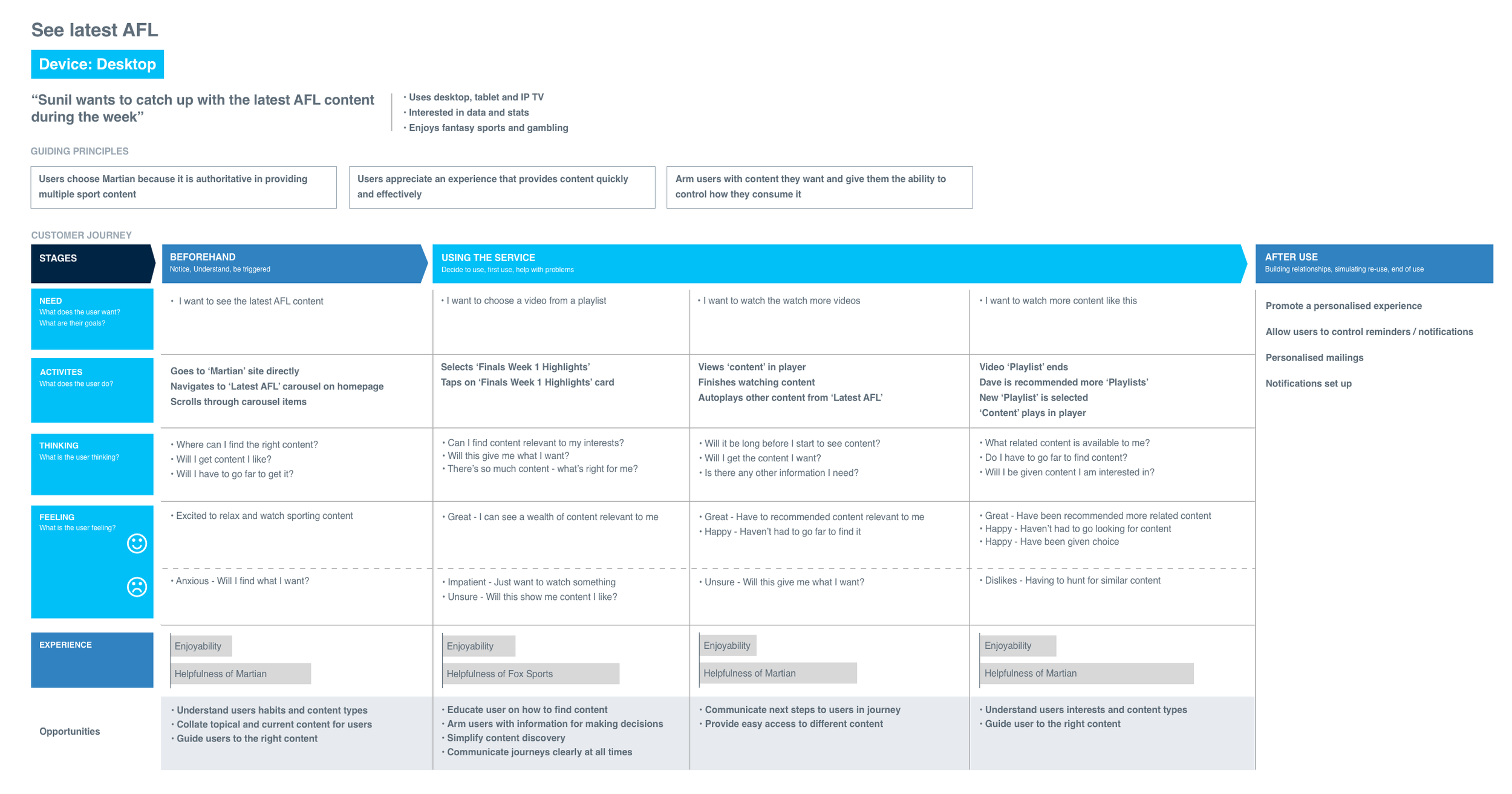
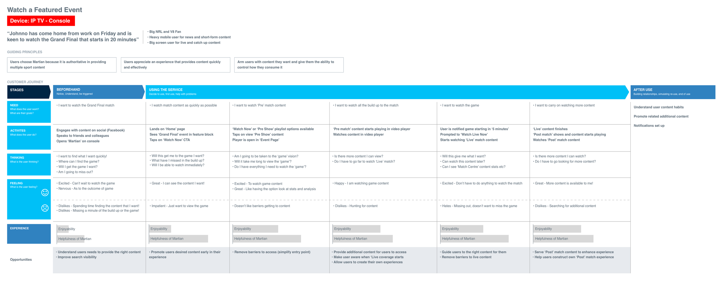
Utilised customer journey maps to identify critical touchpoints and opportunities.
Enhanced the user experience through tailored and personalised interactions.
Research and Analysis
Development of personas post qualitative research and customer interviews
Iterative research and testing of core features and functionality
Streamlined UX Specifications
Authored comprehensive UX specifications, workflows, and wireframes.
Provided clear guidance for development teams to ensure alignment with design objectives.
Intuitive Prototyping
Designed intuitive prototypes prioritising ease of navigation and content discovery.
Ensured a seamless user journey across devices.
Continuous Improvement
Conducted iterative testing and feedback to refine and optimise the user experience.
Addressed user pain points and enhanced engagement metrics.
Approach.
Employing a simple, iterative process.
A cyclical design process is a dynamic and iterative approach to problem-solving that involves three key phases: Discover, Iterate, and Implement. In the Discover phase, insights are gathered to interpret the needs of users through research and observation, identifying the core problems and opportunities. During the Iterate phase, ideas are generated and refined through prototyping and testing, allowing for continuous feedback and improvements. Finally, in the Implement phase, a refined solution is developed and launched, followed by further evaluation to ensure it meets user and business needs.
Discover.
Stakeholder Workshops
User Interviews
Qualitative Surveys
User Observation
Competitor Analysis
Problem Definition
Iterate.
Wireframes
User Flows
Service Blueprints
Prototyping
User Testing
Feedback Analysis
Implement.
Detailed UI Design
User Interviews
Technical Development
Product Testing & QA
Product Launch
Evaulation
Discover.
Research & Exploration
Engaging in excess of 200 participants. Leading the UX function we conducted a series of moderated and unmoderated testing, subjecting participants to a full set of prototypes and first phase designs to help define pain points and opportunities. Using these insights, product features and capabilities were further developed and re-tested. This was a cyclical process until the system and service designs met expectations for both the business and customer.


Iterate.
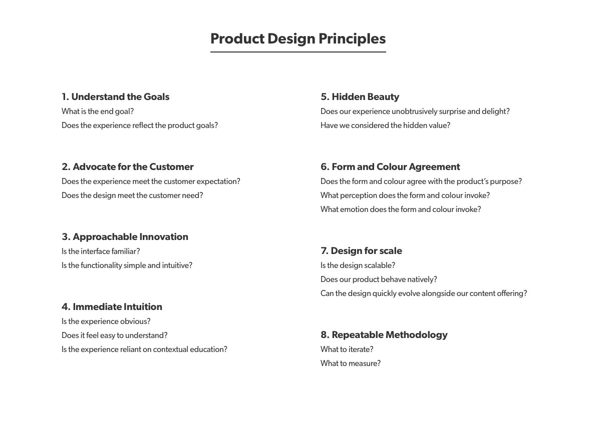
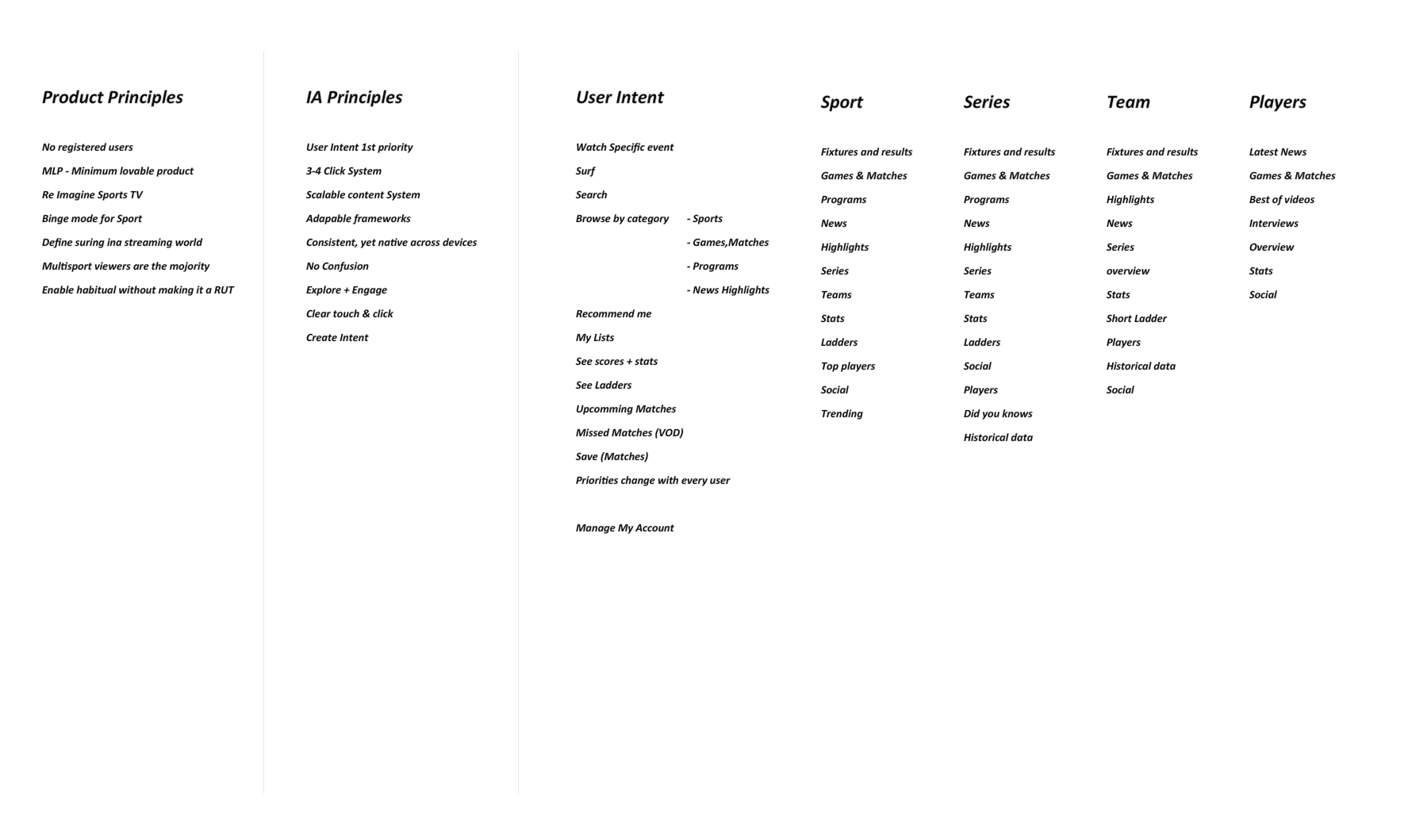
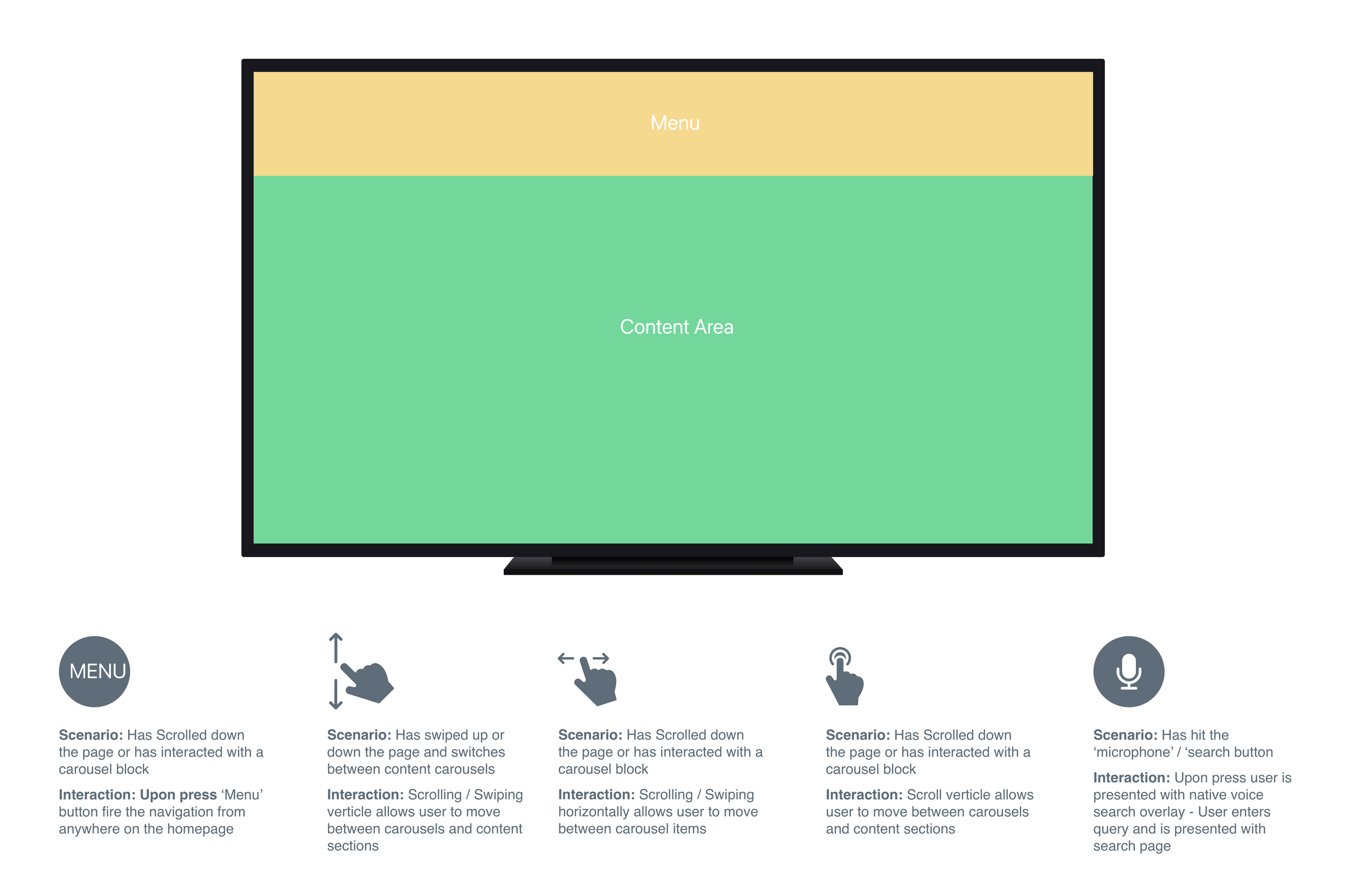
Product & Experience Principles
We developed a set of product & experience principles that emphasised a consistent, intuitive design across all devices and platforms to foster user familiarity and recognition. By maintaining uniform navigation structures, visual cues, and interaction patterns, we ensure a seamless and cohesive user experience. This consistency helps users develop habitual usage patterns, enhancing their comfort and efficiency in navigating the platform, regardless of the device they are using. The goal is to create an engaging and reliable experience that feels familiar every time users interact with our service, driving both user satisfaction and brand loyalty.

Experience & Service Design
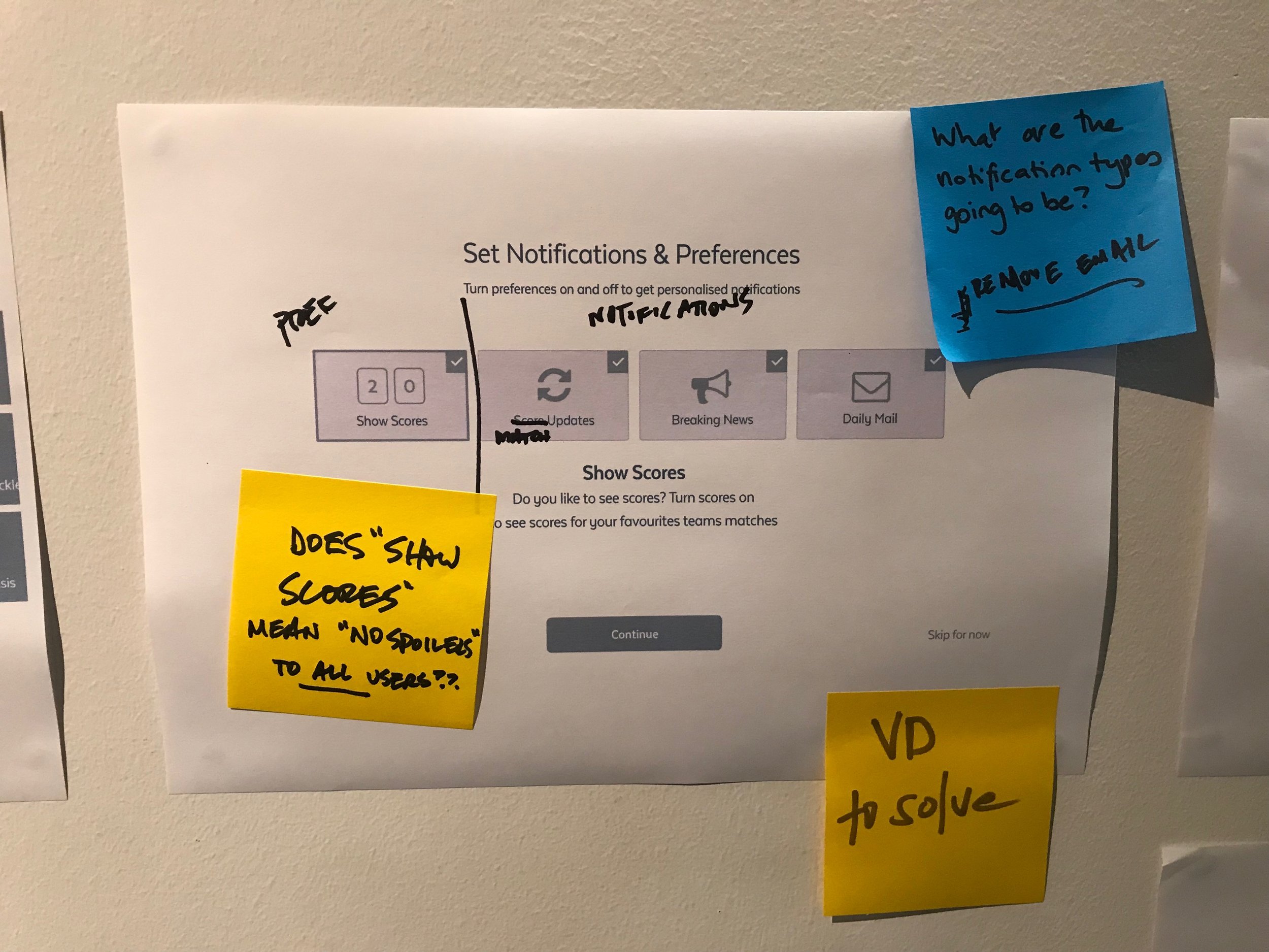
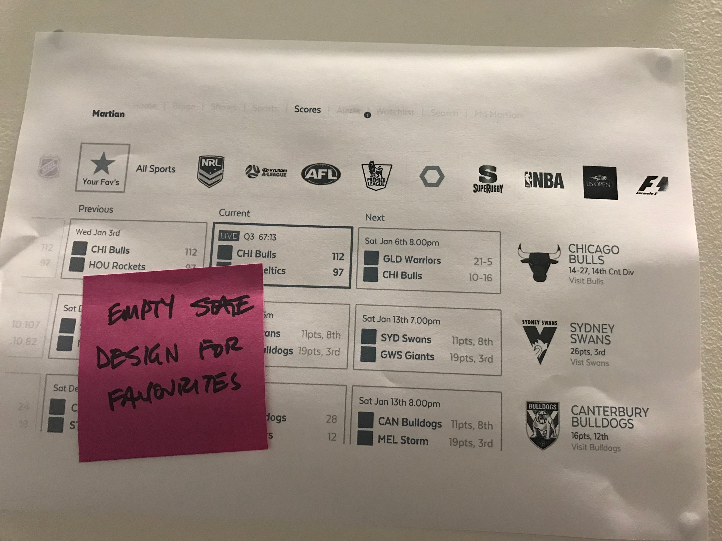
We used two-week sprints to set up initiatives with Epic Briefs and Requirements, designs and flows were extensively documented for better collaboration. I converted requirements into wireframes and prototypes, creating core flows for stakeholder reviews and detailed flows for customer testing.
Features that passed customer testing were documented with user translations at every breakpoint and linked to tech tickets, with visual design components added to the component library and font variations included in the Font Matrix. Tech review sessions ensured close collaboration between Product and Tech teams. Completed tech tickets were reviewed by the product team across eight breakpoints, from mobile to television, before deploying to staging.
We developed 12 features and sections, each undergoing 12+ design iterations, resulting in over 12,000 wireframes. This detailed process provided a solid foundation for the UI design and development phases.





Experience Design & Development
We used two-week sprints to set up initiatives with Epic Briefs and Requirements, designs and flows were extensively documented for better collaboration. I converted requirements into wireframes and prototypes, creating core flows for stakeholder reviews and detailed flows for customer testing.
Features that passed customer testing were documented with user translations at every breakpoint and linked to tech tickets, with visual design components added to the component library and font variations included in the Font Matrix. Tech review sessions ensured close collaboration between Product and Tech teams. Completed tech tickets were reviewed by the product team across eight breakpoints, from mobile to television, before deploying to staging.
We developed 12 features and sections, each undergoing 12+ design iterations, resulting in over 12,000 wireframes. This detailed process provided a solid foundation for the UI design and development phases.
Features & Functionality.
Homepage
On-Boarding
Login
Showpages
Fixtures
Video Player
Match Centres
Event Centres
Profiles
Favourites
My Account
Settings


Implement.
Build & Operational
As the project moved into the build phase, the technology and development teams took charge of implementing the features and functions, addressing both frontend and backend requirements. To ensure the product was built to design and specification, we conducted thorough product QA, covering a wide range of platforms and devices, including iOS and Android for mobile and tablet, Apple TV, Android TV, CTV, Roku, and desktop. This comprehensive testing ensured high-quality standards were met across all platforms.
By leveraging usage data and customer experience insights, we were able to significantly enhance product performance, operational efficiencies, and customer satisfaction. Analysing platform usage patterns allowed us to identify optimisation opportunities, streamline processes, and eliminate bottlenecks. Concurrently, customer experience data provided a deeper understanding of user needs and pain points, enabling us to tailor features and functionalities to better meet their expectations.
This dual approach ensured our product remained responsive and user-centric, driving both efficiency and satisfaction. Additionally, by developing real-time monitoring dashboards, we could visualise key performance metrics and make informed, data-driven decisions, continuously refining the product to deliver exceptional value to our users.
Platforms.
Web
iOS
TvOS
Android (Mobile)
Android TV
CTV
Telstra TV
Playstation
Xbox
Summary.
The success of Kayo Sports demonstrates the importance of a user-centric approach to design, continuous iteration based on user feedback, and effective collaboration between design and development teams. By prioritising the user experience and aligning design with business goals, we achieved remarkable results and drove significant growth for the organisation.
Achievements
Rapid Growth: Within the first year of launch, Kayo Sports attracted over 400K subscribers, exceeding initial projections and establishing itself as a market leader in the OTT sports streaming industry.
High-Quality Experiences: Customer satisfaction scores soared, reflecting the success of our user-centric design approach in delivering high-quality, tailored experiences.
Efficient Development: Streamlined UX specifications and collaborative approach with development teams resulted in efficient development processes and faster time-to-market for new features and updates.
Results
Kayo Sports subscription checkout remains market-leading in conversion rates.
Kayo Sports has approximately 1.6 million subscribers, averaging over 3 hours of viewing weekly.
Kayo boasts an NPS of 49, just behind Netflix (52).
We Created several first to market features SplitView, Key moments, Kayo minis and interactive graphics.
Kayo received the Best User Experience award at the 2018 OTT Awards.


